Putting Free and Open Source GIS Software (QGIS 2.0) Under-Stress for producing Jakarta Flood Map

Peta banjir di website BPBD DKI Jakarta
The peak of rain season has arrived, and as usual, Jakarta always got flooded around December until February each year. Information about where flood happen is very important, public need open access to know and understand where the affected areas are. But, of course textual information is not enough. That is why DKI Jakarta Provincial Disaster Agency (Badan Penanggulangan Bencana Daerah (BPBD) Provinsi DKI Jakarta) with assistance from Humanitarian OpenStreetMap Team (HOT), funded by Australia-Indonesia Facility for Disaster Reduction (AIFDR-DFAT Australian Aid ) is creating Jakarta flood map this year.

Control room in BPBD DKI Jakarta

HOT team + AIFDR staff are creating maps for Jakarta flood response.
Everyone needs to know that all maps that have been published to the public are NOT produced with commercial or paid software. We are using free and open source software, QGIS 2.0 which is available in qgis.org for Windows, OSX, and Linux. We are putting this free software under stress to create good maps with fast and efficiently.

QGIS 2.0 in OSX
During the producing process, there are 3 phases:
- Data collection, data processing, and entry data
- Symbology setting
- Layouting
Phase 1: Data collection, data processing, and entry data
For BPBD flood maps, data are collected from report (where head of villages reporting regularly) through call center, fax, even BBM. All the report goes into BPBD DKI Jakarta Operation Center. Then, BPBD staff are recaping all the data into form like this:
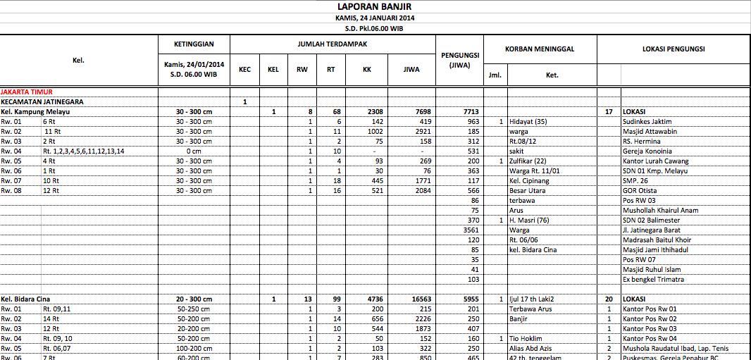
This form showing list which villages and sub-villages affected with flood, including water level information

No data = no maps. Data is important!
That kind of recapitulation is reported every 6 hours (if the flooding is quite intense). So, there will be 4 reports each day: 12am, 6am, 12pm, and 6pm.
Then, we are processing the data by creating class of water level.
- Class 1: 10 – 70 cm
- Class 2: 71 – 150 cm
- Class 3: > 150 cm
- Class 4: Reported that the area is affected, but there is no water level information yet.
Next, we are entrying the data using QGIS 2.0. We are using sub-villages boundary from OpenStreetMap. We are pulling the vector file from OpenStreetMap then we set the attributes table like this:

KAB_NAME is District, KEC_NAME is Sub-District, KEL_NAME is Village, and RW is sub-village
We are adding new column, “affected” and “tinggi”. To indicate that a sub-village is affected by flood, we give value 1. And to indicate the water level class, we put value based on water level class inside “tinggi” column. We are putting the value based on the report given by BPBD staff. The longer the report (meaning lot of sub-village affected), the longer the entry data process. It can take 1-2 hours during intense flood, even more.
Phase 2: Symbology setting
After data entry, we are setting up the symbology. QGIS 2.0 layer properties UI is quite simple and easy to understand. We can set the symbology based on value from a column. If we want to show affected sub-villages, we are using “affected” column. But if we want to show water level classification, we are using “tinggi” column. Other symbology such as boundary needs to be set up too, so the map will be easy to understand and anyone can read it 

Phase 3: Layouting

Layouting maps in QGIS 2.0
Designing a map layout is setting up a final map so the map will be ready to print and distribute. We are paying attention the maps component such as title, scale, legend, etc. The layout should be designed perfectly, and each component has meaning. The more information that you put into layout, then the map will be more amenable. Since people would know where they have to reach if there is something wrong with the map. So, if you want to display the map, it should be displayed completely with the additional information :)
All final products can be seen at http://bpbd.jakarta.go.id/peta-banjir/
For chronological map animation, actually it’s a group of map that we designed with the same symbology and layout. And we compiled those maps based on time-series. All maps are joined with GIF creator software (GIFFun is good enough for OSX, in case you wondering )
)
Want to learn more about OSM and QGIS? We have the guide: http://openstreetmap.or.id/resources/guide/